Income Statement (Profit and Loss) Waterfall Chart Guide
Your income statement, or profit and loss statement (P&L), is the standard way to compare your company’s net revenue to its expenditures over a given period of time. But just because it’s the GAAP standard for financial reporting doesn’t mean the format is digestible for other stakeholders in the business.
Instead of presenting dense tables of information in a profit and loss statement, the best finance teams find ways to meet business partners where they are and present information in a way they’ll understand.
One way finance has traditionally visualized profit and loss data is with an income statement waterfall chart. But while a profit and loss waterfall chart can provide a high-level overview of an income statement’s movements, you can go a step further to drill down into your cash burn.
Table of Contents
What Is an Income Statement Waterfall Chart?
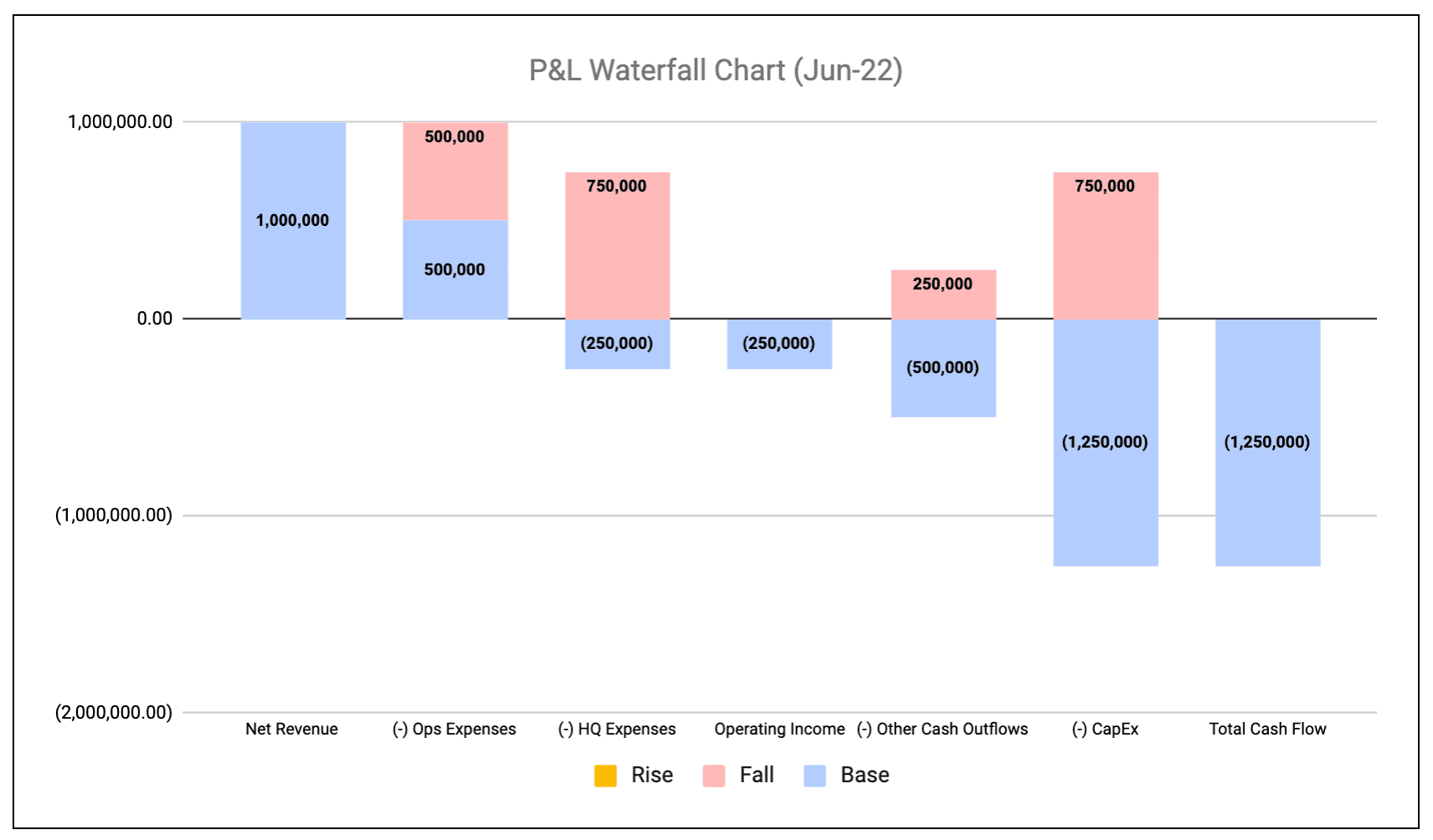
An income statement waterfall chart is a way to visualize income and expenditures over a given period of time. It’s a basic chart that includes a starting value for net revenue and presents floating bars that represent the expense side of the P&L statement.
After all expenditures are accounted for, the final result is a total cash flow bar that represents the bottom line for your business.
For high-growth, VC-backed companies that aren’t yet profitable, it’s common to call this kind of waterfall chart a cash burn bridge because it ultimately shows how much money you burned over the given period of time. You can see an example below.
How to Create a Profit and Loss Waterfall Chart
If you’ve created any type of waterfall chart (like an ARR bridge or a sales pipeline waterfall), the steps to create a profit and loss waterfall chart will look familiar.
Generally speaking, the configuration of an income statement waterfall matches other waterfall use cases, just with different inputs and the potential to add a variance analysis component.
1. Configure the Data Table
The cornerstone of your income statement waterfall is the data table of inputs for the chart.
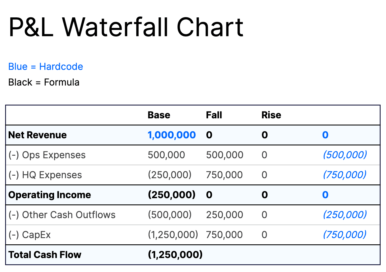
There’s no one-size-fits-all set of inputs for an income statement waterfall chart, but at the very least you should have these general sections:
- Net revenue. The amount of revenue earned from selling products and services in a given period. This is the starting value for the waterfall.
- Operating expenses. Any expenses from normal business operations, including sales, marketing, product development, and payroll.
- HQ expenses. Any real estate-related expenses (like rent) that contribute to overall operating costs.
- Operating income. Income after accounting for operating and HQ expenses. This is a midpoint value in the waterfall chart, not necessarily an input to change on its own.
- Other cash outflows. A catchall category for any cash outflows that you need to take away from net operating income but don’t fit into other inputs of the waterfall chart.
- CapEx. Capital expenditures for the given period, including costs to purchase, upgrade, or otherwise maintain physical assets.
- Total cash outflow. The ending value that represents your bottom line for the given period after all expenses have been deducted.
You can build out the waterfall chart further by adding more inputs to your data table. For example, if you want to show expenses at the account level, you’d just need to list out inputs for each income statement account. This will make maintaining and updating the chart more tedious but also adds more context to the visualization.
2. Create the Waterfall (or Stacked Column) Chart
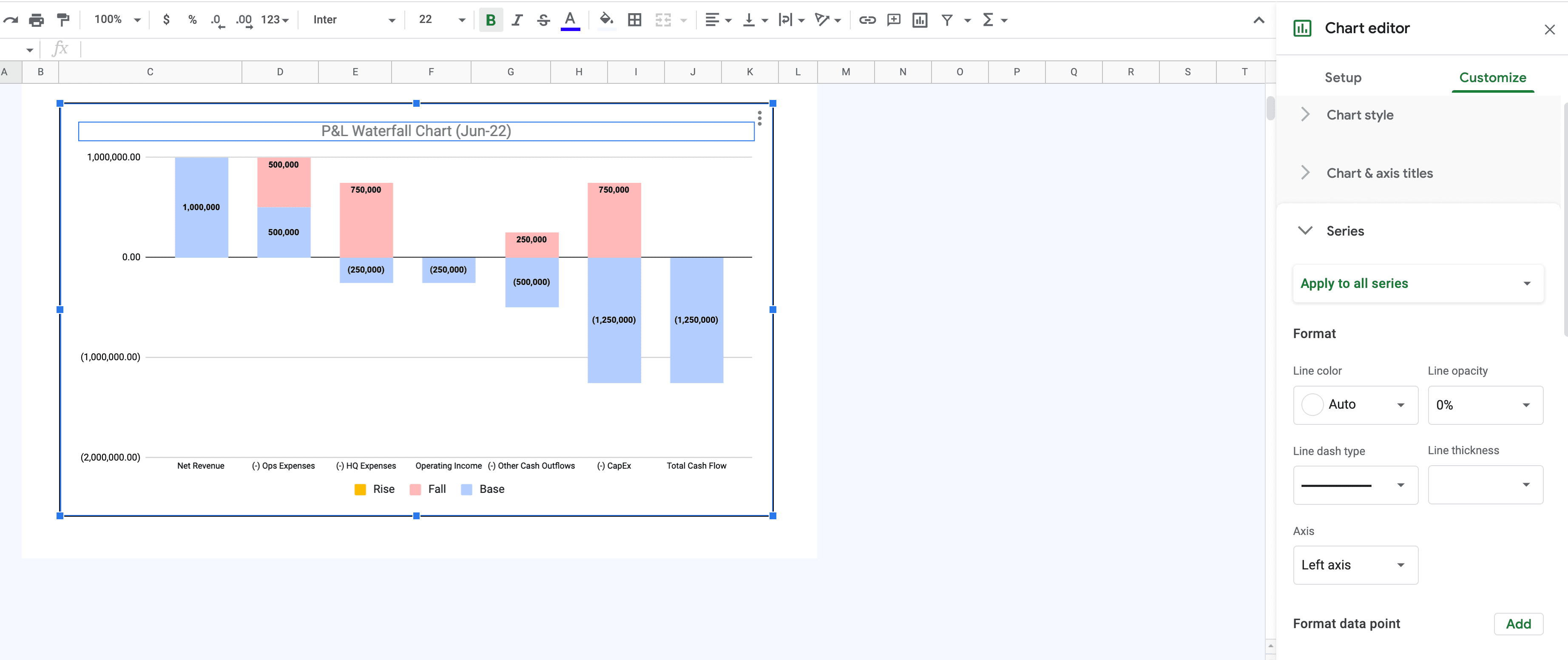
Once you have the data table configured how you want, you can use the functionality in Excel or Sheets to format the data visualization. In Excel, there’s a specific waterfall option you can use. In Sheets, you can achieve the same results using the stacked bar chart option.
You can then start customizing the chart according to your formatting and design preferences. You can add data labels to quickly show the changes at each stage. Or, you can update colors for individual bars to make the visualization more appealing to your stakeholders.
3. Add a Budget vs. Actuals Component (Optional)
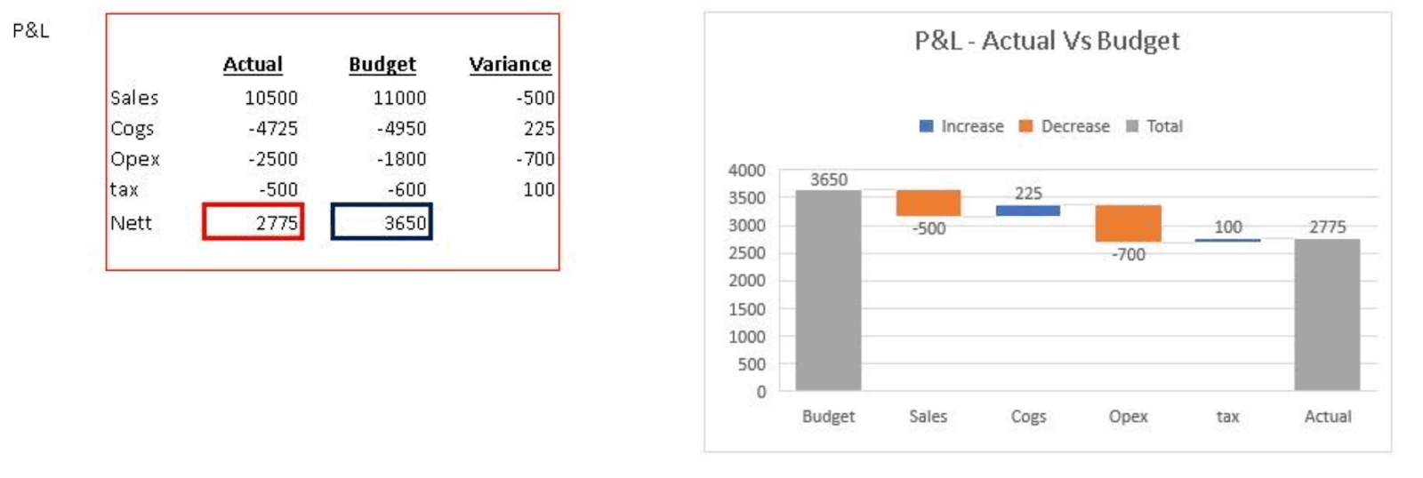
One way that you can take your profit and loss waterfall chart a step further and gain more insight into P&L management is to add a budget vs. actual variance component.
In the same spreadsheet as your original income statement waterfall, create a new data table that has columns for actuals, budget values, and variance (where variance is a replacement for the “change” column above). You can see a simple version of this approach below.
Why a Waterfall Chart Isn’t the Most Impactful Income Statement Visualization
The walkthrough above will help you create a traditional income statement waterfall chart and budget vs. actuals waterfall chart. But what happens when your business partners or investors ask you to drill down into the data?
There’s a time and place for waterfall charts, but this traditional visualization tool may not be the best approach for presenting P&L insights across your business.
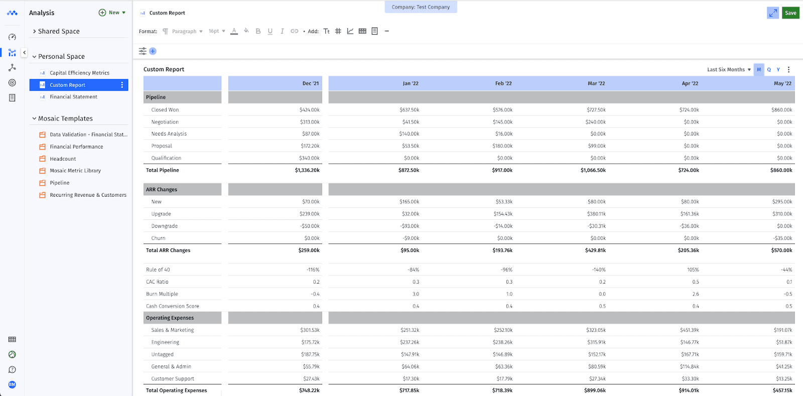
A better option would be to take advantage of strategic finance software like Mosaic to visualize your data in a more digestible, insightful way. You can do this with a custom reporting approach:
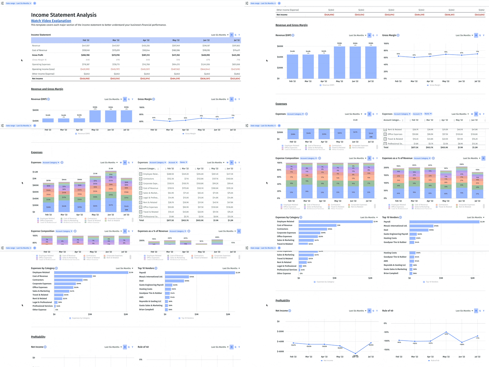
Or, you can use Mosaic’s analytics tools to analyze income statement metrics and add attributes that allow you and your partners to view the data at a more granular level with just a few clicks, in real time:
Don’t Go Chasing Waterfalls — Use Our P&L Waterfall Template
If you want to use a P&L waterfall to present your income statement data to executives and board members, you shouldn’t have to sink time into making sure you get the formatting and calculations right.
Download our spreadsheet-based income statement waterfall template to get started faster and get a clearer view of your cash burn. And streamline your other waterfall use cases by downloading our other templates:
- Revenue bridge chart
- Sales pipeline waterfall chart
- Bookings to revenue waterfall model
- Bookings to cash waterfall model
But don’t stop short at just using a spreadsheet template. If you’re ready to unlock your true strategic value, Mosaic can help you take financial analysis much further than possible in spreadsheets.
Mosaic’s analytics tools give you 125+ out-of-the-box metrics and KPIs as well as custom reporting features to easily show period-over-period changes and variances with real-time actuals.
Ready for a demo of Mosaic? Reach out and schedule time for a personalized walkthrough.
Shift to Real-Time, Self-Service Financial Reporting
Continue reading...
Own the of your business.

